Problem / Challenge.
Boy Scouts of America is the largest scouting organization and one of the largest youth organizations in the United States, with about 2.3 million youth participants and nearly one million adult volunteers.
Over the years, BSA has created different digital products and services to facilitate both young people’s activities and the support of their parents and mentors. However, as more digital products kept adding, they lost consistency in their image and use. They needed to unify their UI/UX design.
Yes, we solved it right!
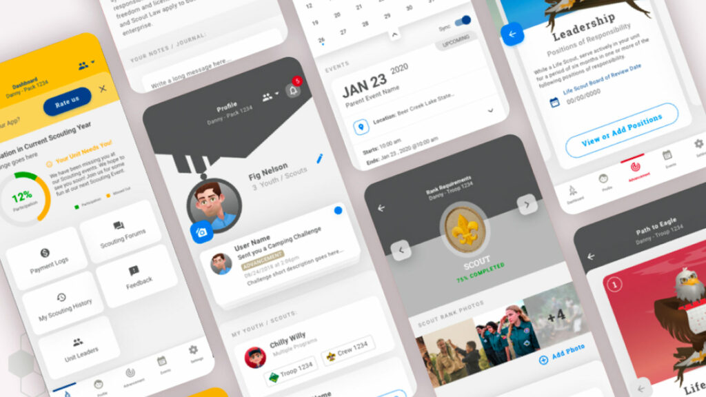
The design and UX team of The Ksquare Group realized this problem. The team redesigned and unified the digital properties at the BSA’s request to have a unique and institutionalized brand. The users were scouts, their parents, or mentors. They felt the same experience all the time, no matter which application or website they were using.
A new design system was worked upon that integrated new interface components and a consistent interaction design that was quickly replicable between different applications. Complementary to this, we created illustrations with a unique and defined style. The new design system also allowed for closer and more assertive communication with the development teams.
The outcome.
- With the new consistency in the Boy Scouts of America apps, there is greater use and engagement within them, resulting in increased donations. As a bonus now, the internal BSA team is more resilient and has greater creative freedom than ever.


